gapminder %>%
  summarize(meanLifeExp = mean(lifeExp))
# A tibble: 1 × 1
meanLifeExp
<dbl>
1 59.5In this chapter, you’ll return to the topic of data transformation with dplyr to learn more ways to explore your data.
You’ve learned to use the extracting data using filter verb to pull out individual observations, such as statistics for the United States in 2007. Now you’ll learn how to summarize many observations into a single data point.

You’ve seen how to find the mean life expectancy and the total population across a set of observations, but mean() and sum() are only two of the functions R provides for summarizing a collection of numbers. Here, you’ll learn to use the median() function in combination with summarize().
# A tibble: 1 × 1
  medianLifeExp
          <dbl>
1 60.7library(gapminder)
library(dplyr)
# Summarize to find the median life expectancy
gapminder%>%
summarize(medianLifeExp = median(lifeExp))# A tibble: 1 × 1
medianLifeExp
<dbl>
1 60.7Rather than summarizing the entire dataset, you may want to find the median life expectancy for only one particular year. In this case, you’ll find the median in the year 1957.
The summarize() verb allows you to summarize multiple variables at once. In this case, you’ll use the median() function to find the median life expectancy and the max() function to find the maximum GDP per capita.
max() function to find the maximum.# A tibble: 1 × 2
medianLifeExp maxGdpPercap
<dbl> <dbl>
1 48.4 113523.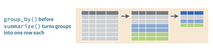
group_by verbIn a previous exercise, you found the median life expectancy and the maximum GDP per capita in the year 1957. Now, you’ll perform those two summaries within each year in the dataset, using the group_by verb.
# A tibble: 12 × 3
    year medianLifeExp maxGdpPercap
   <int>         <dbl>        <dbl>
 1  1952          45.1      108382.
 2  1957          48.4      113523.
 3  1962          50.9       95458.
 4  1967          53.8       80895.
 5  1972          56.5      109348.
 6  1977          59.7       59265.
 7  1982          62.4       33693.
 8  1987          65.8       31541.
 9  1992          67.7       34933.
10  1997          69.4       41283.
11  2002          70.8       44684.
12 2007 71.9 49357.You can group by any variable in your dataset to create a summary. Rather than comparing across time, you might be interested in comparing among continents. You’ll want to do that within one year of the dataset: let’s use 1957.
# A tibble: 5 × 3
  continent medianLifeExp maxGdpPercap
  <fct>             <dbl>        <dbl>
1 Africa             40.6        5487.
2 Americas           56.1       14847.
3 Asia               48.3      113523.
4 Europe             67.6       17909.
5 Oceania 70.3 12247.In the previous section you learned to use the group by and summarize verbs to summarize the gapminder data by year, by continent, or by both. Now you’ll learn how to turn those summaries into informative visualizations, by returning to the ggplot2 package.
You would construct the graph with the three steps of ggplot2: - The data, which is by_year. - The aesthetics, which puts year on the x-axis and total population on the y-axis. - And the type of graph, which in this case is a scatter plot, represented by geom_point.
ggplot(by_year, aes(x = year, y = totalPop)) +
geom_point()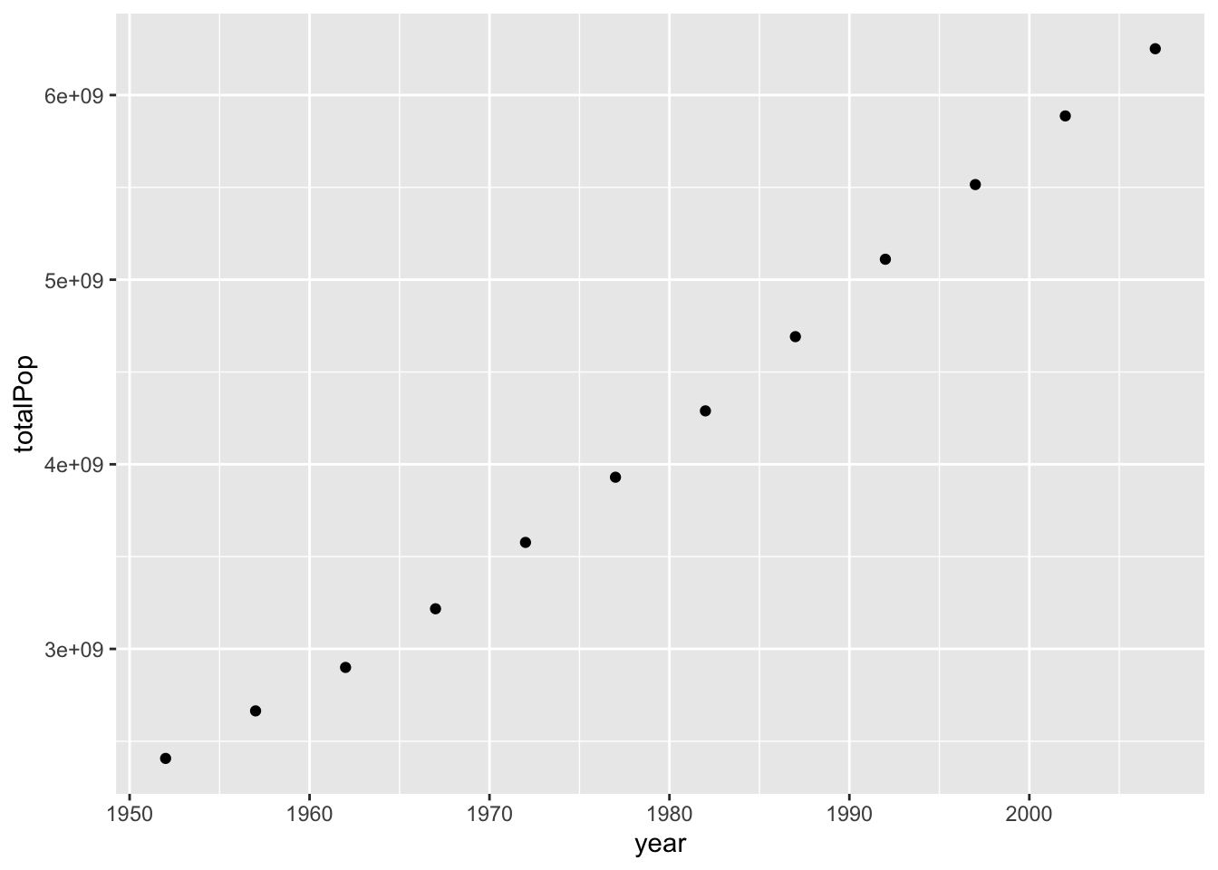
Notice that the steps are the same as when you were graphing countries in a scatter plot, even though it’s a new dataset. The resulting graph of population by year shows the change in the total population, which is going up over time. ggplot2 puts the y-axis is in scientific notation, since showing it with nine zeros would be hard to read. The global starts a little under 3 times 10 to the 9th power- that’s three billion- and goes up to more than 6 billion.
You might notice that the graph is a little misleading because it doesn’t include zero: you don’t have a sense of how much the population grew relative to where it was when it started. This is a good time to introduce another graphing option.
ggplot(by_year, aes(x = year, y = totalPop)) +
  geom_point() +
  expand_limits(y = 0)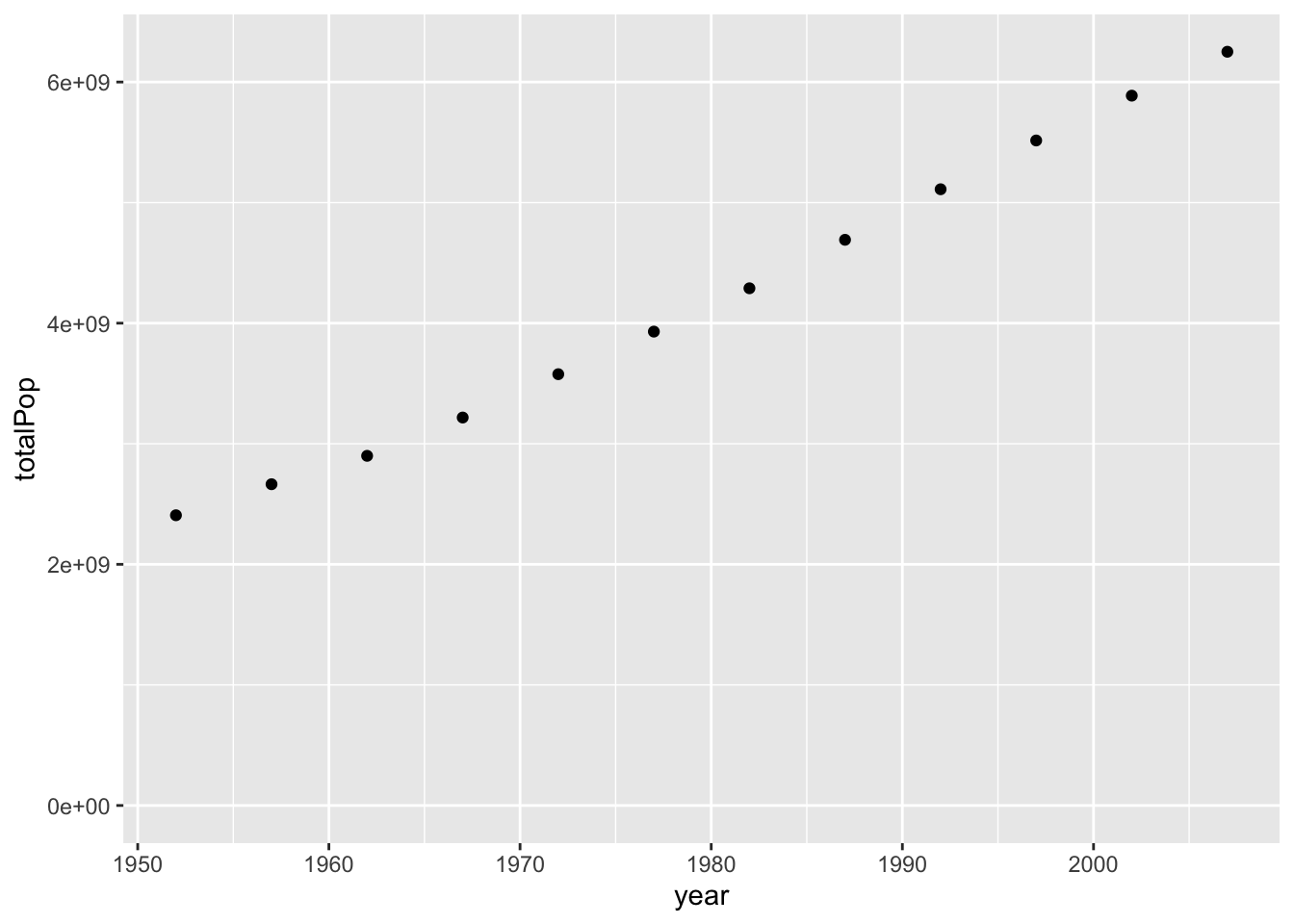
By adding “expand underscore limits y = 0” to the end of the ggplot call, you can specify that you want the y-axis to start at zero. Notice that you added it to the end just like you would with scale_x_log10, or facet_wrap. Now the graph makes it clearer that the population is almost tripling during this time.
You could have created other graphs of summarized data, such as a graph of the average life expectancy over time, by changing the y aesthetic.
Since you now have data over time within each continent, you need a way to separate it in a visualization. To do that you can use the color aesthetic you learned about in chapter two. By setting color equals continent, you can show five separate trends on the same graph.
ggplot(by_year_continent, aes(x = year, y = totalPop, color = continent)) +
  geom_point() +
  expand_limits(y = 0)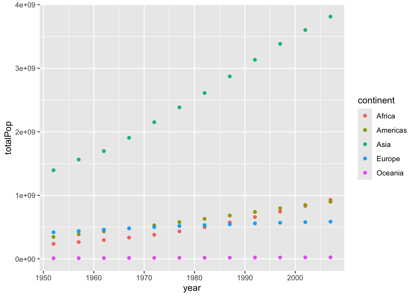
This lets us see that Asia was always the most populated continent and has been growing the most rapidly, that Europe has a slower rate of growth, and that Africa has grown to surpass both Europe and the Americas in terms of population.
In the last chapter, you summarized the gapminder data to calculate the median life expectancy within each year. This code is provided for you, and is saved with as the by_year dataset. Now you can use the ggplot2 package to turn this into a visualization of changing life expectancy over time.
by_year <- gapminder %>%
  group_by(year) %>%
  summarize(medianLifeExp = median(lifeExp),
            maxGdpPercap = max(gdpPercap))

by_year
# A tibble: 12 × 3
year medianLifeExp maxGdpPercap
<int> <dbl> <dbl>
1 1952 45.1 108382.
2 1957 48.4 113523.
3 1962 50.9 95458.
4 1967 53.8 80895.
5 1972 56.5 109348.
6 1977 59.7 59265.
7 1982 62.4 33693.
8 1987 65.8 31541.
9 1992 67.7 34933.
10 1997 69.4 41283.
11 2002 70.8 44684.
12 2007 71.9 49357.by_year dataset to create a scatter plot showing the change of median life expectancy over time, with year on the x-axis and medianLifeExp on the y-axis. Be sure to add expand_limits(y = 0) to make sure the plot’s y-axis includes zero.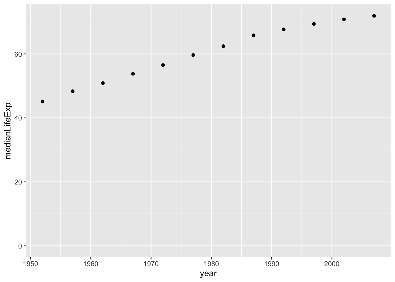
library(gapminder)
library(dplyr)
library(ggplot2)

by_year <- gapminder %>%
  group_by(year) %>%
  summarize(medianLifeExp = median(lifeExp),
            maxGdpPercap = max(gdpPercap))

# Create a scatter plot showing the change in medianLifeExp over time
ggplot(by_year,aes(x = year, y = medianLifeExp))+
  geom_point()+
  expand_limits(y=0)
In the last exercise you were able to see how the median life expectancy of countries changed over time. Now you’ll examine the median GDP per capita instead, and see how the trend differs among continents.
medianGdpPercap.= to save this summarized data as by_year_continent.`summarise()` has grouped output by 'continent'. You can override using the
`.groups` argument.# A tibble: 60 × 3
# Groups: continent [5]
continent year medianGdpPercap
<fct> <int> <dbl>
1 Africa 1952 987.
2 Africa 1957 1024.
3 Africa 1962 1134.
4 Africa 1967 1210.
5 Africa 1972 1443.
6 Africa 1977 1400.
7 Africa 1982 1324.
8 Africa 1987 1220.
9 Africa 1992 1162.
10 Africa 1997 1180.
# ℹ 50 more rows
library(gapminder)
library(dplyr)
library(ggplot2)

# Summarize medianGdpPercap within each continent within each year: by_year_continent

by_year_continent = gapminder%>%
                        group_by(continent, year)%>%
                        summarize(medianGdpPercap = median(gdpPercap))
`summarise()` has grouped output by 'continent'. You can override using the
`.groups` argument.# Plot the change in medianGdpPercap in each continent over time
ggplot(by_year_continent, aes(x = year, y = medianGdpPercap,color = continent))+
geom_point()+
expand_limits(y = 0)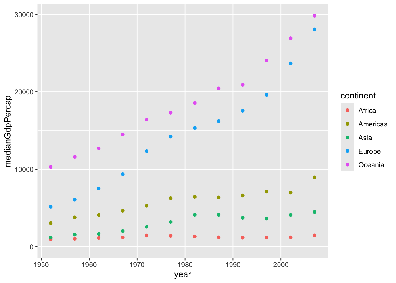
In these exercises you’ve generally created plots that show change over time. But as another way of exploring your data visually, you can also use ggplot2 to plot summarized data to compare continents within a single year.
# A tibble: 5 × 3
  continent medianLifeExp medianGdpPercap
  <fct>             <dbl>           <dbl>
1 Africa             52.9           1452.
2 Americas           72.9           8948.
3 Asia               72.4           4471.
4 Europe             78.6          28054.
5 Oceania            80.7          29810.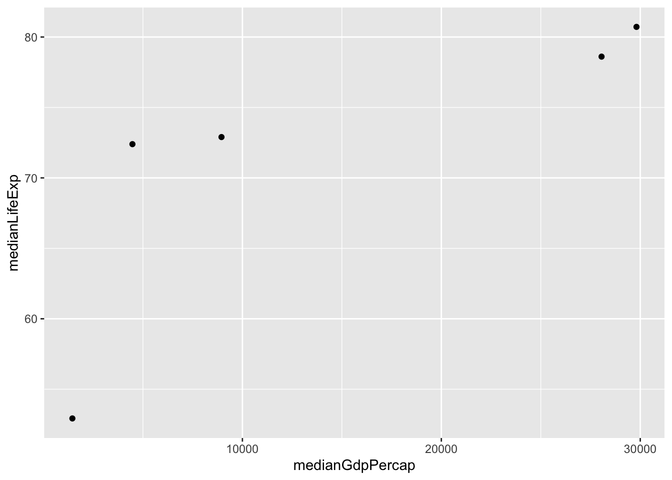
library(gapminder)
library(dplyr)
library(ggplot2)

# Summarize the median GDP and median life expectancy per continent in 2007
by_continent_2007 = gapminder%>%
                    filter(year ==2007)%>%
                    group_by(continent)%>%
                    summarize(medianLifeExp = median(lifeExp), medianGdpPercap = median(gdpPercap))

# Use a scatter plot to compare the median GDP and median life expectancy
ggplot(by_continent_2007, aes(x = medianGdpPercap, y = medianLifeExp,colot = continent))+
geom_point()